0 Comments

One problem with collecting this stuff so haphazardly over so many years is that almost none of it has any kind of provenance. I get something from someone who collects all sorts of film memorabilia in order to resell it to the one person who might want a particular item… and that’s generally as far back as it goes. No information as to the genuine origin of anything. So, most of what I can say about any item is from observation and inference.

Black and white 8x10 transparency containing the poster side of the 2-sided poster foldout promoting TIMES SQUARE (1980) to movie theater bookers. The image measures approximately 9 7/16" x 6 5/16".

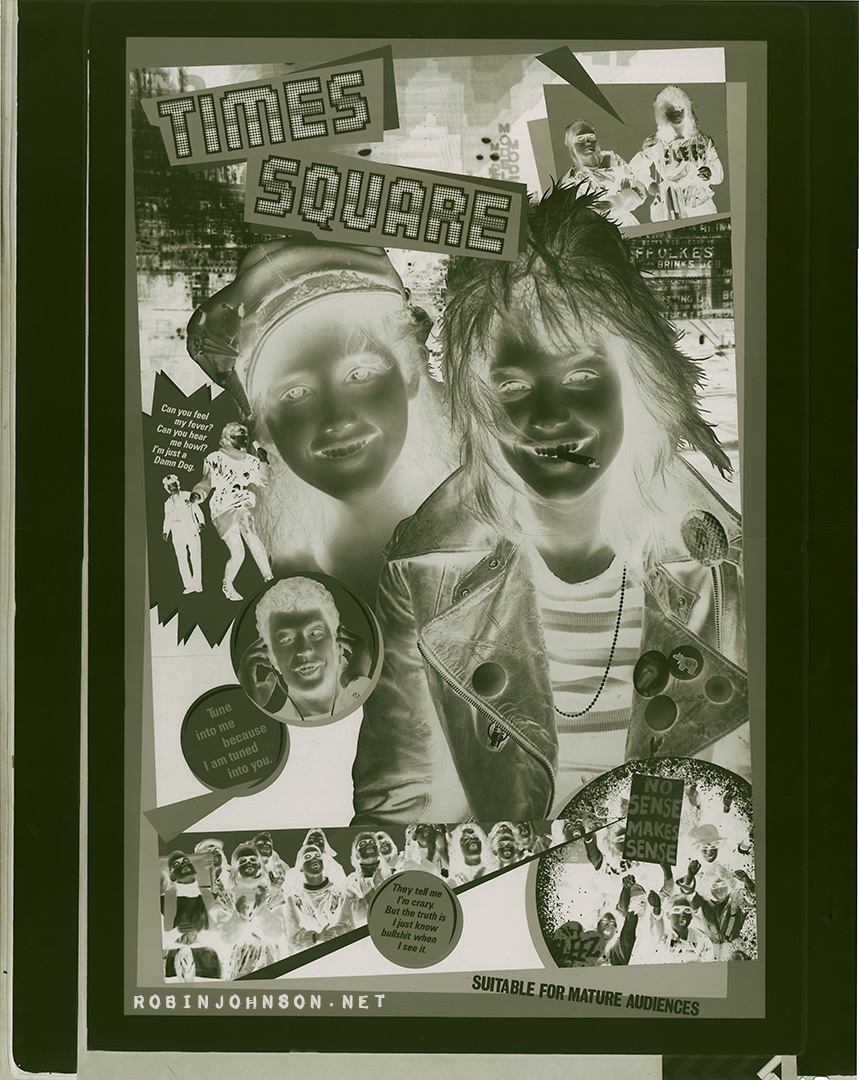
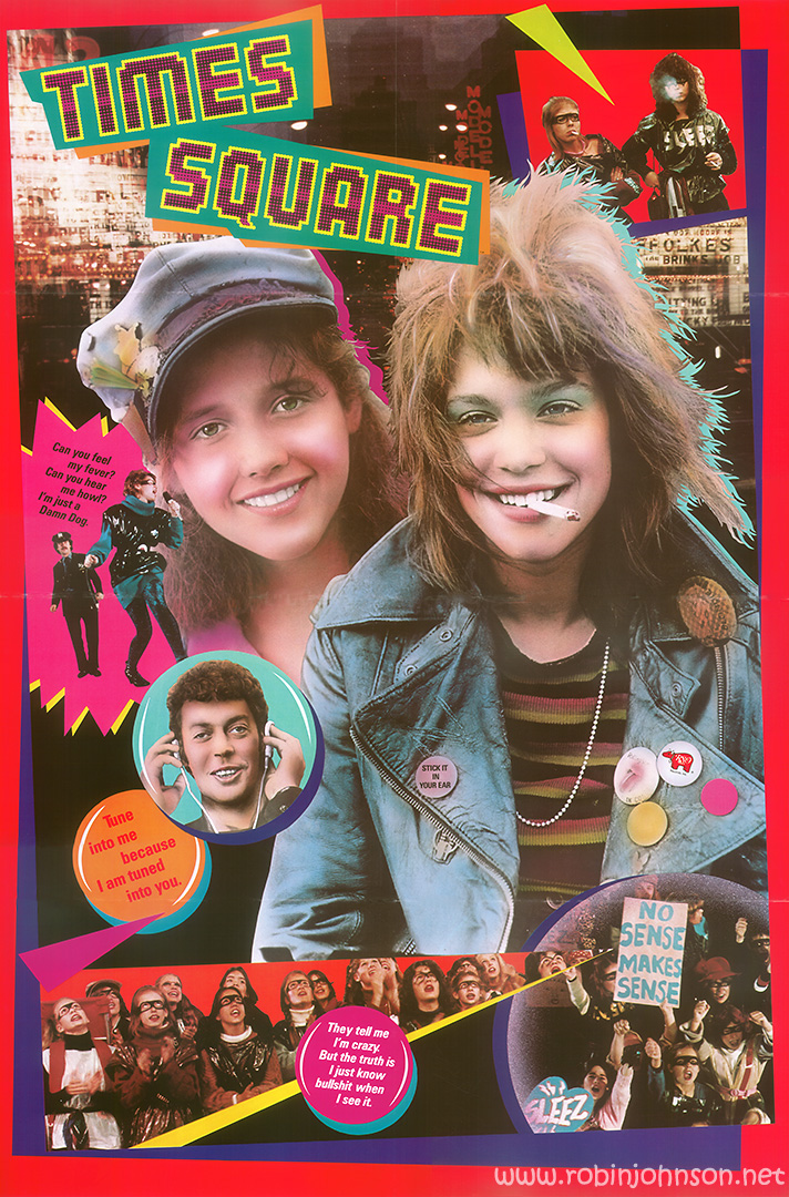
This is an 8 x 10 inch black and white negative transparency, containing an approximately 9 1/2 x 6 1/4 inch image of the poster side of the two-sided promotional foldout designed by Seiniger & Associates, with the addition of the words “suitable for mature audiences.” That’s a description and as much as I can swear to being actual fact. Based on that, I’ll say that since this sort of transparency was used to print ads in newspapers and magazines, this was used to print an ad promoting Times Square in a publication aimed at movie theater owners and bookers. I don’t know of any such publication, but it’s hard to believe that such a thing did not exist, and may yet exist. So there may still be out there a catalog of all the upcoming movie releases for 1980 that you may want to run at your theater, containing an extra full page ad for Times Square before the poster design was finalized. Or maybe not, since until such a thing turns up there’s no evidence this ad actually ran anywhere.

Black and white 8x10 transparency containing the poster side of the 2-sided poster foldout promoting TIMES SQUARE (1980) to movie theater bookers. The image measures approximately 9 7/16" x 6 5/16".


Times Square ©1980 StudioCanal/Canal+


Leave a Reply

Your email address will not be published. Required fields are marked *

Related Posts

Designed to be opened one fold at a time, the blue side ia a promotional presentation for "Times Square" and its soundtrack, and the red side is a full poster. This is the red side. Text: TIMES SQUARE Can you feel my fever? Can you hear me howl? I'm just a Damn Dog. Tune into me because I am tuned into you. STICK IT IN YOUR EAR. NO SENSE MAKES SENSE They tell me I'm crazy. But the truth is I just know bullshit when I see it.

The Mystery of the Double-Sided Poster, Side Two

Fully opening the two-sided poster reveals my favorite version of the image most associated with Times Square. As I mentioned last time, I find the red background more visually pleasing than the yellow used on the movie poster and soundtrack album cover. There are several other differences in this version,…

Times Square UK Pressbook, 1980-81, pages 1-5

I'd given up all hope of ever finding one of these when, bam, two of them turn up. It's the EMI version of the pressbook issued in the USA by AFD. It's shorter in page count, but larger in size, and printed in color on heavier, glossier paper. It doesn't…

Times Square UK Pressbook, 1980-81, pages 6-7

This is the center spread of the glossy UK pressbook for Times Square. Of the seven images circling the European logo, four are cropped from photos used on UK lobby cards (clockwise from top left, that would be One, Two, Five, and Seven). Of the three remaining: Four is a…