This is either the only truly unique item I have, or the most worthless.
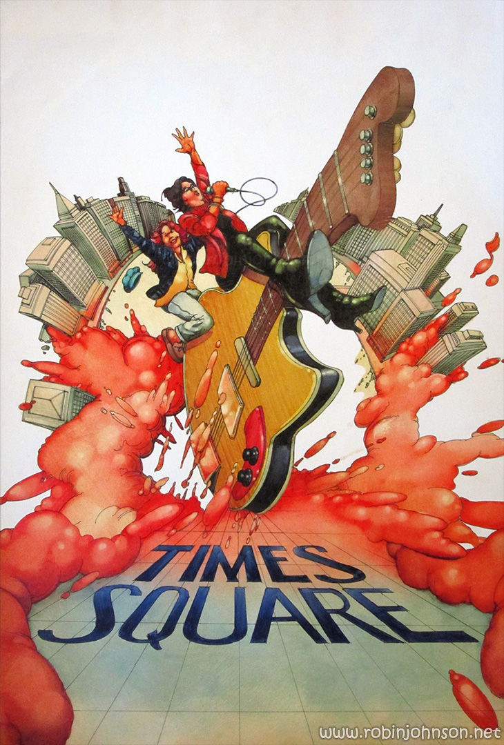
It’s a 15″ x 22.5″ board, unsigned, gray on the back, and the front being pen and colored ink or watercolor (I don’t know nearly enough about art technique to be able to tell reliably). I’ve been referring to it as “collage” because when I first saw it it looked like it had been assembled from a number of pieces cut out and pasted to the board, but on closer examination it appears that the art was created on a single separate piece of board, then affixed to this board and the outline cut out and removed, revealing the white space that dominates the top. There are blade score marks on the white area, going along with and past the line of the art.
I purchased it from a collector/dealer of movie memorabilia, who had also purchased it from a collector/dealer of movie memorabilia (and left that receipt with it when he sent it to me), and that’s as far back as its provenance goes. It is a piece of original art created sometime before 2003. But who created it, and why, is technically a matter of speculation. It could be a particularly misguided piece of fan art.
But, that’s exactly why I believe it to be authentic. Why would a fan put so much work into a piece that so spectacularly misses any of the points of the film? Nicky and Pammy exploding from a rubbery cityscape on a giant flying guitar… It so accurately captures the feel of a generic “star-is-born” rock’n’roll movie of the mid-70’s. It’s exactly what someone at Seiniger Advertising would have produced in 1980 if they’d only yet seen a few stills of Nicky and Pammy and the briefest synopsis created by RSO, and nothing else, particularly the soundtrack list. There’s almost nothing of Allan Moyle’s tale of two runaways in the big city, and nothing of Robert Stigwood’s New Wave extravaganza. The only way a fan would have made this is if the concept behind it was “rejected poster idea for Times Square.” And in that case, why didn’t they finish it?
So until I find out differently: this is an actual and quite rightly rejected poster idea for Times Square. It might have been an appropriate direction if the soundtrack had still featured Linda Ronstadt, but thankfully someone realized they were trying to sell the Ramones and the Ruts, and this wasn’t going to cut it with that audience.
(On the other hand, if I’ve just mortally offended some fan who put their heart and soul into this and then had it go missing… I apologize profusely!)
15 in (W) x 22.5 in (H) (work);
1080 px (W) x 730 px (H), 96 dpi, 384 kb (image)